> ## Documentation Index
> Fetch the complete documentation index at: https://docs.vendo.run/llms.txt
> Use this file to discover all available pages before exploring further.
# Mount the surface
> The provider, the overlay, the command palette, slots, triggers, and the bare thread: what each one renders and the props that move it.
One provider carries the wire and your brand. Everything below renders inside
it and re-themes from the same token file.
## The provider
`vendo init` never writes a client file. It prints one paste at the end of the
run, naming your layout and the exact lines.
```tsx App Router theme={null}
// app/layout.tsx
import { VendoOverlay, VendoProvider } from "@vendoai/vendo/react";
import type { VendoTheme } from "@vendoai/vendo";
import theme from "../.vendo/theme.json";
// then wrap the app:
{children}
```
```tsx Pages Router theme={null}
// pages/_app.tsx
import { VendoOverlay, VendoProvider } from "@vendoai/vendo/react";
import type { VendoTheme } from "@vendoai/vendo";
import theme from "../.vendo/theme.json";
// then wrap the app:
```
`baseUrl` is where the route is mounted, path prefix included. A deployment
served under `/maple` passes `baseUrl="/maple/api/vendo"`.
The `theme` cast narrows TypeScript's widened JSON string literals. If init
also wrote `.vendo/fonts.css`, import it beside the theme so generated screens
carry your brand font wherever your own stylesheet does not reach.
### The props
| Prop | What it does |
| ------------------------------ | ------------------------------------------------------------------------------------------------------------------- |
| `baseUrl` | The wire mount, path prefix included. Default `/api/vendo`. |
| `theme` | Your brand tokens, merged over Vendo's defaults. |
| `components` | Your own React components the agent may render. See [host components](/generated/host-components). |
| `pinSlot` | Which slot a pin lands in. Set it and the panel's pin button writes the placement for you. |
| `tools` | Friendly labels and field formatting for tool chips and approval cards. |
| `routes` · `onNavigate` | Your pages by name, and your router doing the moving when a generated link is pressed. |
| `intl` | Display currency and locale for every formatter. Defaults to USD and `en-US`. |
| `greeting` · `discoverability` | The first-run intro and starter prompts, or `"quiet"` to stand them down. |
| `captureScreen` | `false` stops the page snapshot riding each send. See [how it works](/product/how-it-works#what-the-agent-can-see). |
A component registry has to live in a `"use client"` file. Declaring it in a
Server Component layout crashes React Server Components serialization once
the registry holds real components, and every page 500s.
## The overlay
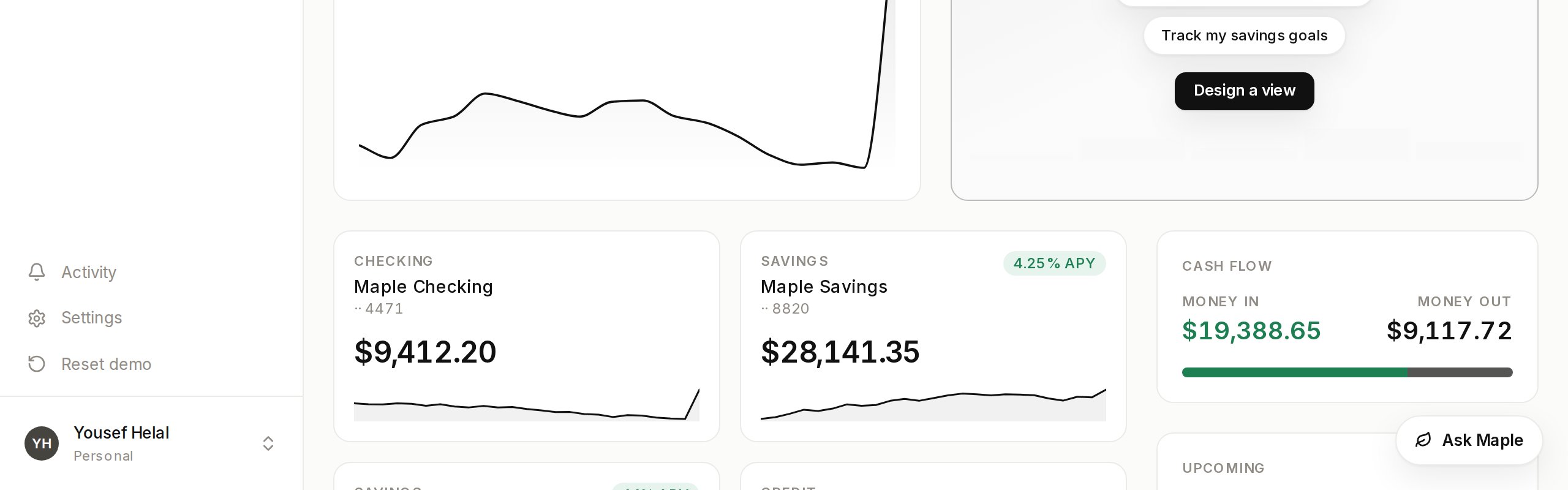
The default drop-in: a launcher pill in the corner that opens the conversation
panel. On phones it becomes a full-bleed takeover below 768px.
The pill is white-label. It reads "AI agent" until you give it your own label
and mark.
```tsx theme={null}
,
}}
/>
```
`position` takes any viewport corner. `offset` nudges the whole cluster inward
when your own UI already lives in that corner, and `launcher="none"` hides the
pill so you can drive the panel yourself.
### Where the panel sits
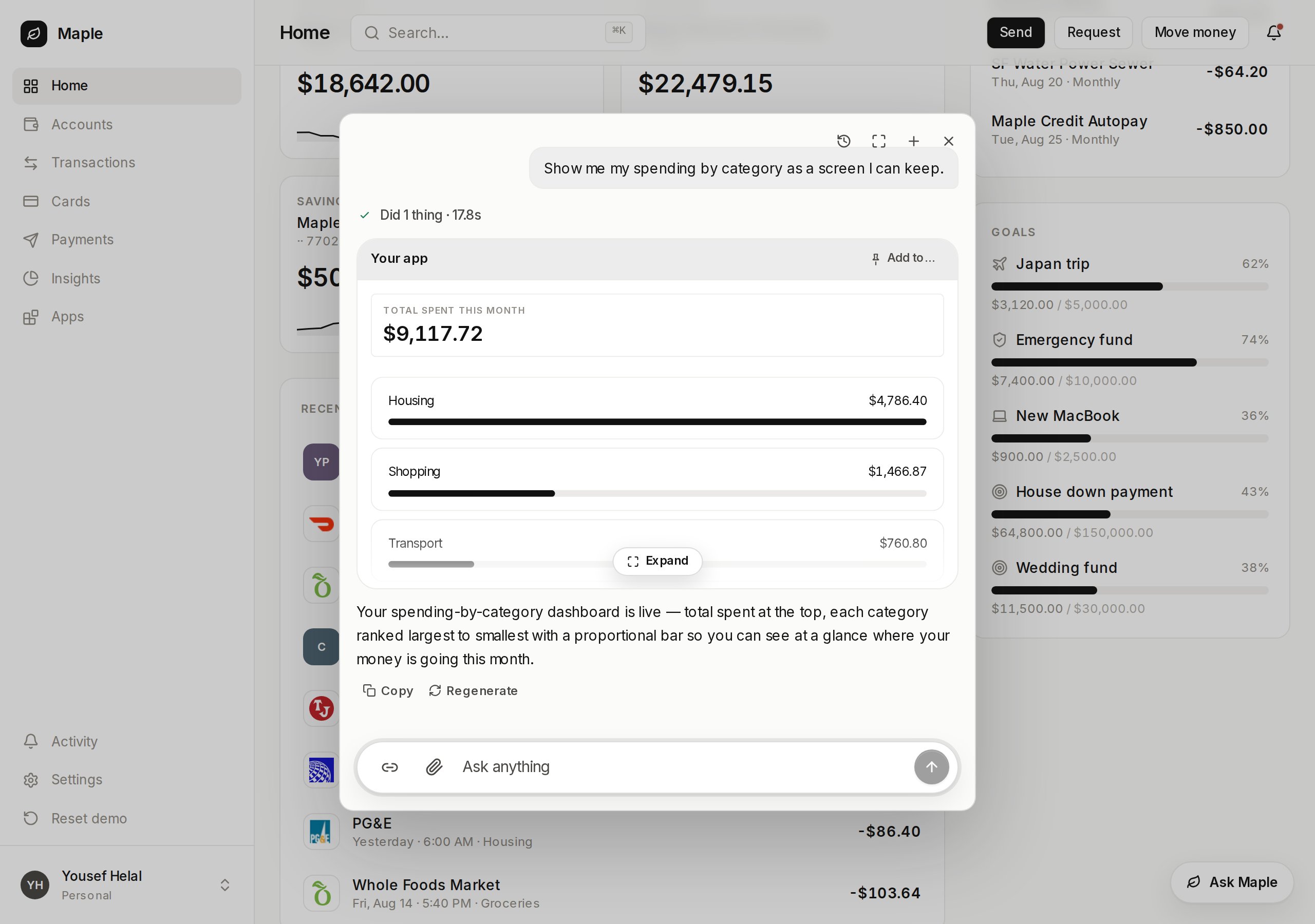
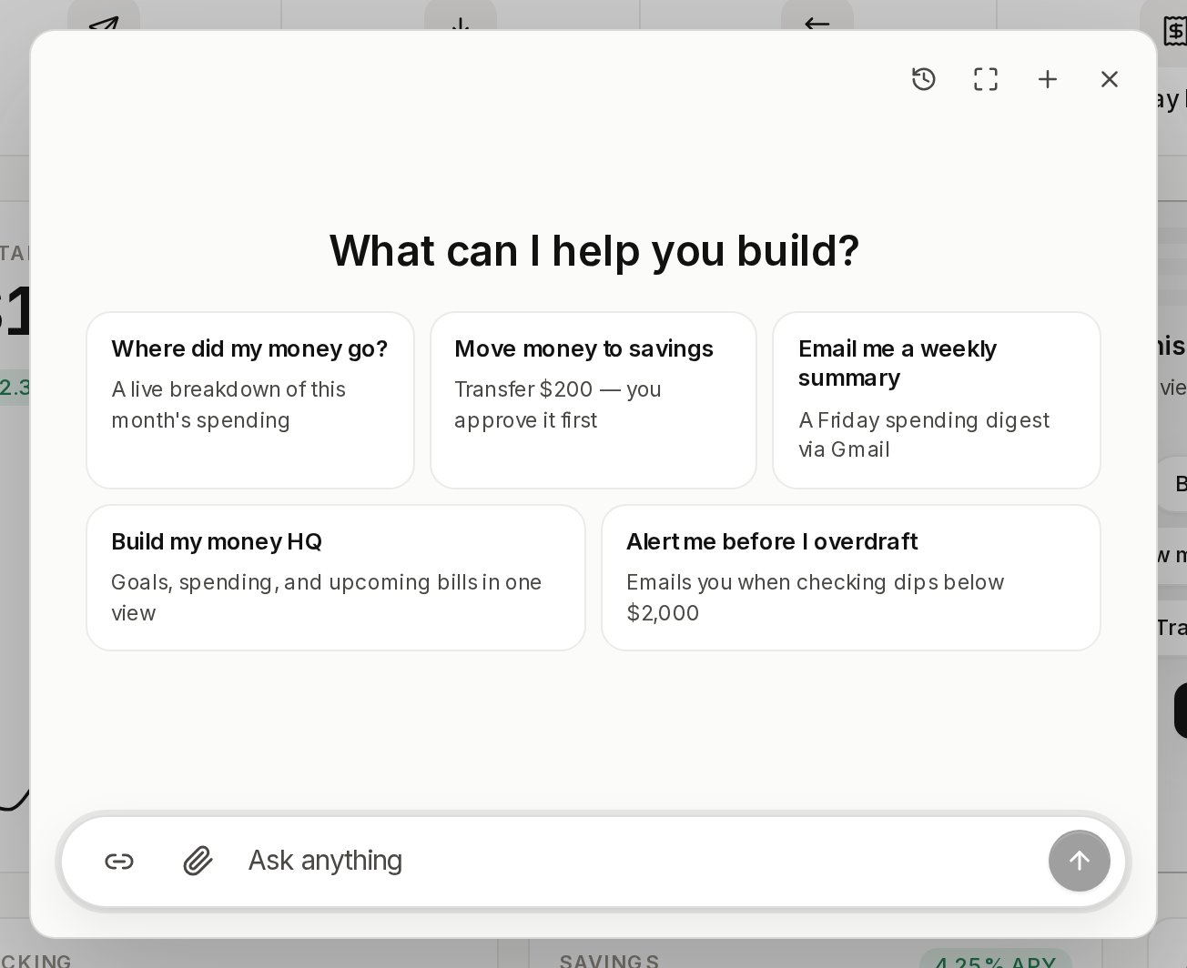
`placement="center"` is the default: a centered box over a scrim, with the
page behind it inert.
`placement="dock"` is the side-panel posture. The panel holds the right edge
full height and your page reflows beside it, staying visible and clickable.
```tsx theme={null}
```
`dockWidth` is also the amount the page reflows by, so the two can never
disagree. It defaults to 420.
### Conversations survive
A reload resumes the conversation the user was in, mid-stream replies
included. The panel's header lists earlier conversations to pick back up.
None of that needs wiring. A remembered conversation that no longer exists
falls back to a fresh start on its own.
### Drive it yourself
`useVendoOverlay` gives you open, close, toggle, and a fresh conversation,
plus the props to hand back to the overlay.
```tsx theme={null}
const overlay = useVendoOverlay();
```
The `thread` prop is the one sanctioned injection point. Pass your own thread
component and the overlay stays the shell: portal, scrim, focus, and the
mobile sheet.
## The command palette
`⌘K` on macOS, `Ctrl+K` elsewhere, opens the same conversation panel in its
compact form.
```tsx theme={null}
import { VendoPalette } from "@vendoai/ui/chrome";
```
Mount it beside the overlay, which is where the palette opens. Its commands
render on the chip strip above the composer: a new conversation, each of the
user's own apps, and their activity.
Pass `onCommand` and every chip activation routes through you instead. Typed
text that matches no command is simply the message.
The binding is a singleton no matter how many palettes mount, and it never
steals a keystroke from a focused input of yours. Pass a chord
(`hotkey={{ key: "j", meta: true }}`), a matcher function, or `false` to wire
your own.
## Slots
A slot is a place in your own page that a generated view can occupy. It comes
from `@vendoai/vendo` itself — nothing extra to install.
```tsx theme={null}
"use client";
import { VendoSlot } from "@vendoai/vendo/react";
```
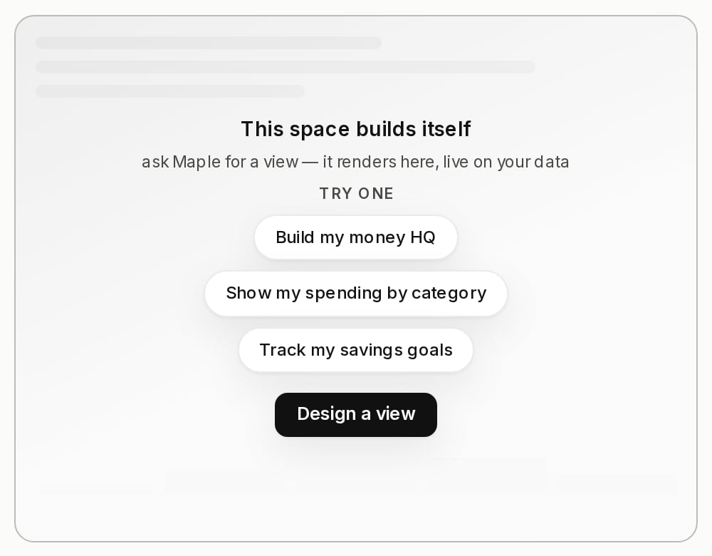
Empty, it renders an invitation: a skeleton, up to three prompt chips that
prefill the composer, and a button that opens the panel. Filled, the view
mounts in place. If that view throws, `children` you passed come back, never a
blank hole — but they also stand in for the invitation, so a slot that should
invite has none.
Every mounted slot reports itself to the server, which is how the panel knows
which places exist. `label` is what a person reads when they pick one, and it
defaults to the id read as words.
A report ages out, though, and a product whose agent is the whole surface never
renders a `` to make one. Declare those instead:
```ts theme={null}
import { createVendo } from "@vendoai/vendo/server";
createVendo({
slots: [
{
id: "spend-breakdown",
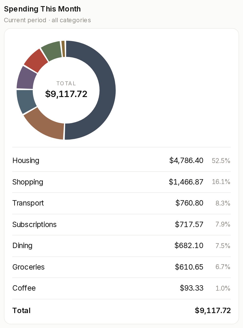
label: "Spend breakdown",
description: "Where this month's spending broke down by category",
},
],
});
```
`description` is optional — it's the sentence an agent reads to pick between
two slots a label alone can't separate. A declared slot needs no render, never
decays, and beats a page report of the same id, so no one's page can rewrite
what you authored.
Declaring one makes it a destination, not a display. The pin lands, but a person
sees what is pinned there only where some page renders a `` with that
id — so a product that renders none still needs to mount one somewhere before a
pinned dashboard is visible to anybody.
To make a pin land somewhere, name the destination on the provider with
`pinSlot`. With one slot the panel shows **Pin to dashboard**; with several,
the same button becomes a picker of your slots.
## Triggers
A button anywhere in your product that hands one task to the agent. It fills
the composer and never sends, so it is safe on any prompt.
```tsx theme={null}
import { VendoTrigger } from "@vendoai/ui/chrome";
Ask about this month
```
`context` rides along so the agent starts oriented on what is on screen. For
your own element instead of this button, call `openVendoConversation({ prompt })`.
## The bare thread
`VendoThread` is the conversation with no shell: composer, streaming replies,
tool chips, approval cards, and generated views arriving inline. Use it when
the conversation belongs inside your own layout.
```tsx theme={null}
import { VendoThread } from "@vendoai/ui/chrome";
```
The same wire is available headless through [the
hooks](/reference/hooks), for a conversation UI you draw yourself.
## Tool labels
Chrome renders a chip every time the agent calls a tool, and an approval card
when a call needs a decision. Without configuration it prettifies the raw id,
so `host_email_send` reads as "Email send".
Pass your own copy through the provider's `tools` prop for user-facing
surfaces.
```tsx theme={null}
const tools: ToolMetaMap = {
host_transferMoney: {
label: "Send money",
description: "Move money between your accounts.",
formatField: (key, value) =>
key === "amount" && typeof value === "number" ? usd(value) : undefined,
},
};
```
`formatField` is display only. The raw arguments still drive the decision, so
formatting a field cannot change what the user is approving.
## Approvals on a generated screen
When someone presses a button inside a generated view and that press needs
approval, the ask arrives as a modal centered over the page.
Presses queue, and exactly one modal is on screen at a time. Escape and the
scrim close it without deciding, so the ask comes back on the next press.
The modal is mounted for you inside `VendoSlot`, in-thread app cards, and the
panel. The decision itself is server-side: see
[what stops a call](/product/how-it-works#what-stops-a-call).
The token file every surface above reads, and how init fills it from your
own brand.
What a generated view can do, who owns it, and how it gets its data.
 `position` takes any viewport corner. `offset` nudges the whole cluster inward
when your own UI already lives in that corner, and `launcher="none"` hides the
pill so you can drive the panel yourself.
### Where the panel sits
`placement="center"` is the default: a centered box over a scrim, with the
page behind it inert.
`position` takes any viewport corner. `offset` nudges the whole cluster inward
when your own UI already lives in that corner, and `launcher="none"` hides the
pill so you can drive the panel yourself.
### Where the panel sits
`placement="center"` is the default: a centered box over a scrim, with the
page behind it inert.
 `placement="dock"` is the side-panel posture. The panel holds the right edge
full height and your page reflows beside it, staying visible and clickable.
```tsx theme={null}
`placement="dock"` is the side-panel posture. The panel holds the right edge
full height and your page reflows beside it, staying visible and clickable.
```tsx theme={null}
 ## Slots
A slot is a place in your own page that a generated view can occupy. It comes
from `@vendoai/vendo` itself — nothing extra to install.
```tsx theme={null}
"use client";
import { VendoSlot } from "@vendoai/vendo/react";
## Slots
A slot is a place in your own page that a generated view can occupy. It comes
from `@vendoai/vendo` itself — nothing extra to install.
```tsx theme={null}
"use client";
import { VendoSlot } from "@vendoai/vendo/react";