> ## Documentation Index
> Fetch the complete documentation index at: https://docs.vendo.run/llms.txt
> Use this file to discover all available pages before exploring further.
# UI surfaces
> Mount VendoProvider in your client, then pick a surface: overlay, palette, thread, generated views, approvals, and slot.
Every chrome surface Vendo renders reads its colors, typography, radius,
density, and motion from your [VendoTheme tokens](/customize/theming). To see
them on your own tools and your own brand, run `vendo init` and follow the
[quickstart](/vendo-agent/quickstart).
Vendo's built-in agent is in beta. Most teams should
[bring their own agent](/existing-agents/quickstart) and use Vendo's tools and surfaces
from their existing loop; the [embeds](/existing-agents/embeds) render Vendo
inside that chat instead of the chrome below.
## The client mount
`vendo init` never writes a client file. It prints one paste at the end of the
run, naming your layout file and the exact lines. That paste is what connects
your pages to the wire, and `vendo doctor` fails until it lands. The wrapped
child differs by router.
```tsx theme={null}
// app/layout.tsx — App Router
import { VendoProvider } from "@vendoai/vendo/react";
// then wrap the app:
{children}
```
```tsx theme={null}
// pages/_app.tsx — Pages Router
import { VendoProvider } from "@vendoai/vendo/react";
// then wrap the app:
```
`baseUrl` is where the wire is mounted, path prefix included. A deployment
served under `/maple` passes `baseUrl="/maple/api/vendo"`.
`` renders nothing by itself. Add `` inside it
for the launcher pill and panel, or render one of the surfaces below.
Registering host components? Put the registry and the provider in one
`"use client"` file and mount that in your layout instead. This file is yours;
init does not generate it.
```tsx theme={null}
// vendo/vendo-root.tsx — yours
"use client";
import { VendoOverlay, VendoProvider } from "@vendoai/vendo/react";
import type { ReactNode } from "react";
import { SpendingDonut } from "@/components/SpendingDonut";
import theme from "../.vendo/theme.json";
import type { VendoTheme } from "@vendoai/vendo";
const registry = { SpendingDonut: { component: SpendingDonut, description: "Spending by category." } };
export function VendoRoot({ children }: { children: ReactNode }) {
return (
{children}
);
}
```
Keep the registry inside a `"use client"` file. Declaring it in a Server
Component layout and passing it to the provider crashes React Server
Components serialization once the registry holds real components — every
page 500s.
The `theme` prop applies the brand init captured. The cast narrows
TypeScript's widened JSON-module string literals.
## Overlay
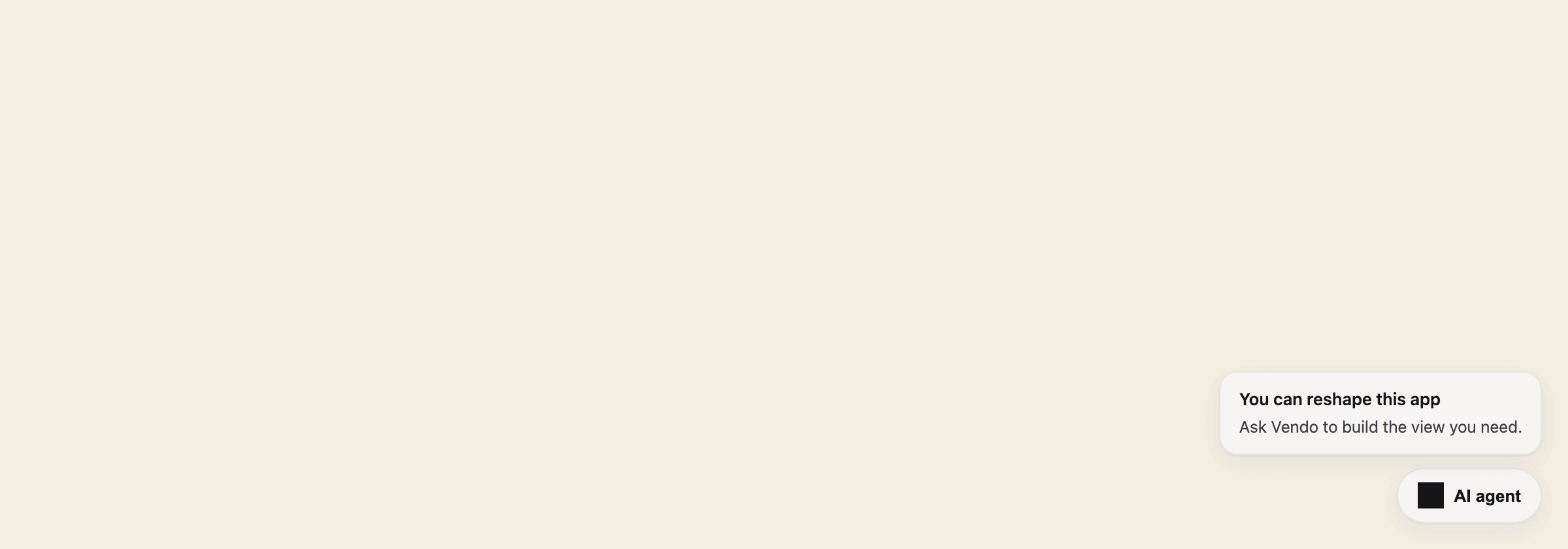
The default drop-in: a themed launcher pill that opens a floating conversation
overlay over your product, becoming an Intercom-style full-bleed takeover on
phones.
 Wire it in [the client mount](#the-client-mount) above; control it
programmatically with
[useVendoOverlay](/reference/hooks#overlay-control-usevendooverlay).
Conversations survive: a page reload resumes the one you were in (the overlay
remembers it per browser and deployment, and a mid-stream reply picks back up),
and the header's previous-conversations button lists your earlier threads —
pick one to resume it, or cancel to stay. New conversation still starts fresh
and clears the remembered one; a remembered conversation that no longer
exists falls back to a fresh start on its own.
### Tune it
`VendoOverlay` comes from `@vendoai/vendo/react`, or from `@vendoai/ui/chrome`
directly. The launcher anchors to any viewport corner
(`launcher="bottom-left"`, `"top-right"`, …), and when your own UI already
lives in that corner, nudge the whole cluster inward with the object form —
`launcher={{ position: "bottom-right", offset: { x: 0, y: 72 } }}`. Set
`launcher="none"` and drive it yourself with the `useVendoOverlay` hook. For a
different surface entirely, swap `` inside your wrapper for
your own composition, or for ``. That one lives in
`@vendoai/ui/chrome` and needs `@vendoai/ui` as a direct dependency.
`` is the only standalone chrome surface
`@vendoai/vendo/react` re-exports; the BYO embeds (``,
``, ``) and every hook come from there too.
## Command palette
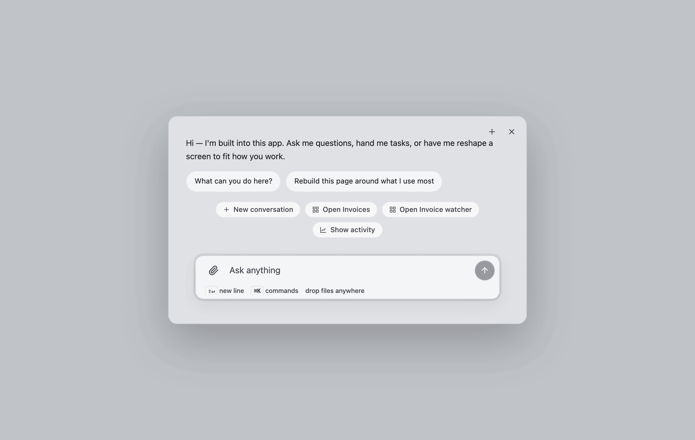
The same surface one keystroke away: **⌘K** opens the conversation overlay in
its compact palette form, with host-registered commands on the chip strip. If
your product already owns ⌘K in a focused input, Vendo stays out of the way.
Wire it in [the client mount](#the-client-mount) above; control it
programmatically with
[useVendoOverlay](/reference/hooks#overlay-control-usevendooverlay).
Conversations survive: a page reload resumes the one you were in (the overlay
remembers it per browser and deployment, and a mid-stream reply picks back up),
and the header's previous-conversations button lists your earlier threads —
pick one to resume it, or cancel to stay. New conversation still starts fresh
and clears the remembered one; a remembered conversation that no longer
exists falls back to a fresh start on its own.
### Tune it
`VendoOverlay` comes from `@vendoai/vendo/react`, or from `@vendoai/ui/chrome`
directly. The launcher anchors to any viewport corner
(`launcher="bottom-left"`, `"top-right"`, …), and when your own UI already
lives in that corner, nudge the whole cluster inward with the object form —
`launcher={{ position: "bottom-right", offset: { x: 0, y: 72 } }}`. Set
`launcher="none"` and drive it yourself with the `useVendoOverlay` hook. For a
different surface entirely, swap `` inside your wrapper for
your own composition, or for ``. That one lives in
`@vendoai/ui/chrome` and needs `@vendoai/ui` as a direct dependency.
`` is the only standalone chrome surface
`@vendoai/vendo/react` re-exports; the BYO embeds (``,
``, ``) and every hook come from there too.
## Command palette
The same surface one keystroke away: **⌘K** opens the conversation overlay in
its compact palette form, with host-registered commands on the chip strip. If
your product already owns ⌘K in a focused input, Vendo stays out of the way.
 ## Thread
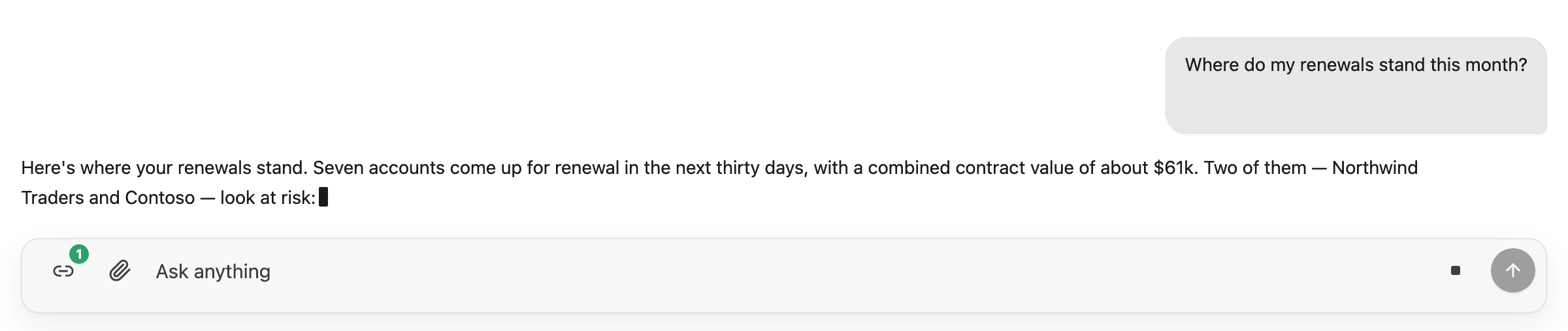
The bare conversation surface: composer, streaming replies, tool beats,
approval cards, connect cards, and generated views arriving inline. Use it
when you want the conversation embedded in your own layout instead of an
overlay.
## Thread
The bare conversation surface: composer, streaming replies, tool beats,
approval cards, connect cards, and generated views arriving inline. Use it
when you want the conversation embedded in your own layout instead of an
overlay.
 Building a custom thread instead? The same wire is available headless; see
[Headless hooks](/reference/hooks#threads).
## Generated views
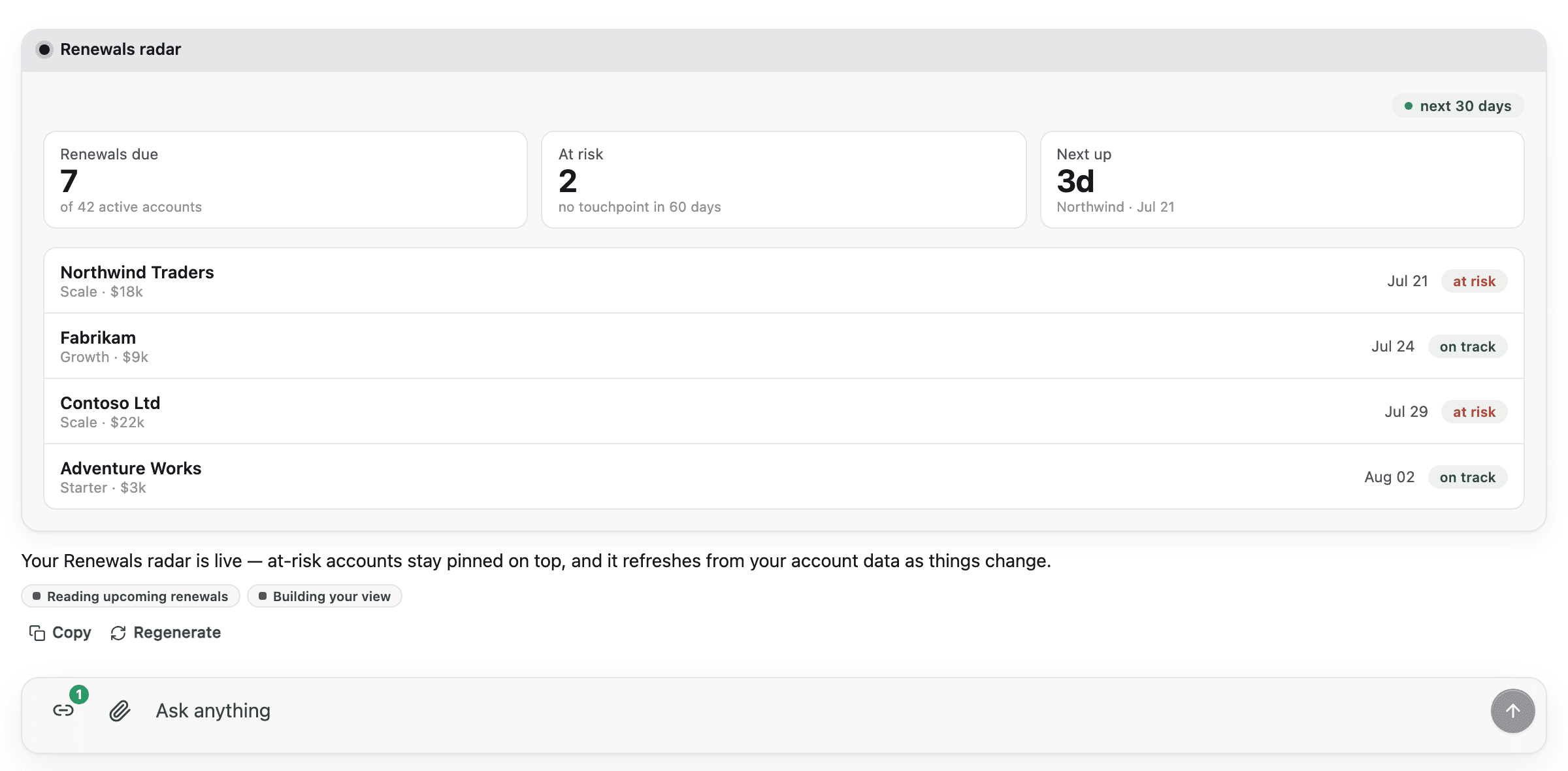
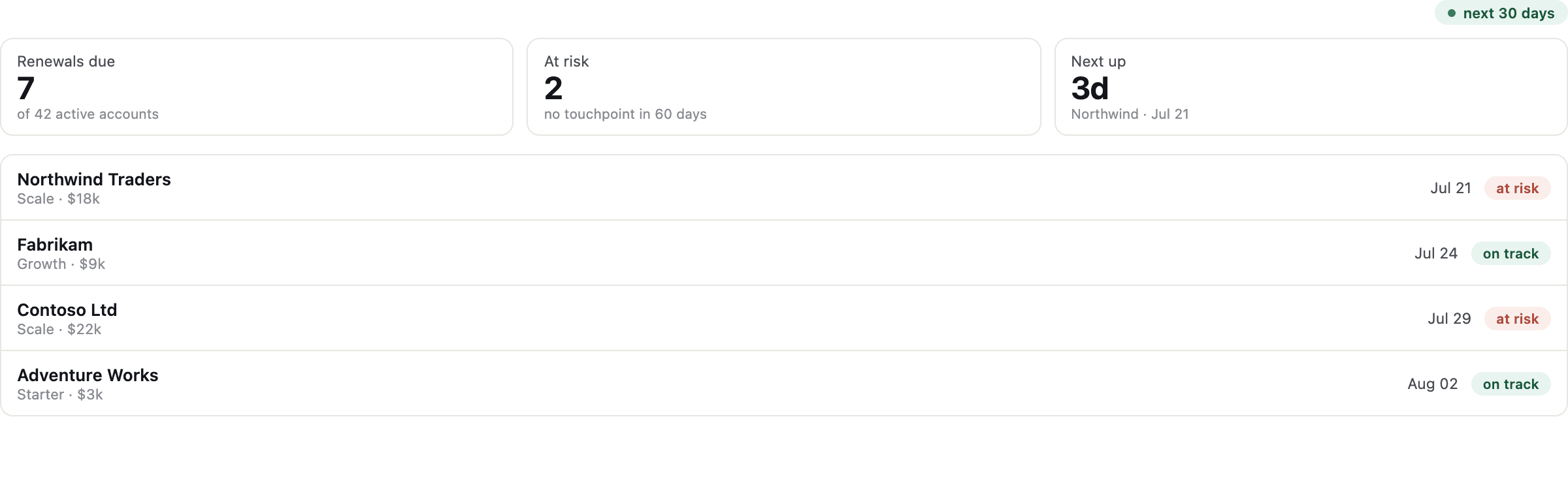
When the agent builds UI, the view streams into the transcript as it forms
(skeleton first, then live pieces) and lands as an interactive component, not
a screenshot.
Building a custom thread instead? The same wire is available headless; see
[Headless hooks](/reference/hooks#threads).
## Generated views
When the agent builds UI, the view streams into the transcript as it forms
(skeleton first, then live pieces) and lands as an interactive component, not
a screenshot.
 See [Generated UI and apps](/capabilities/generated-ui) for what a view can do
and who owns it.
## Approvals
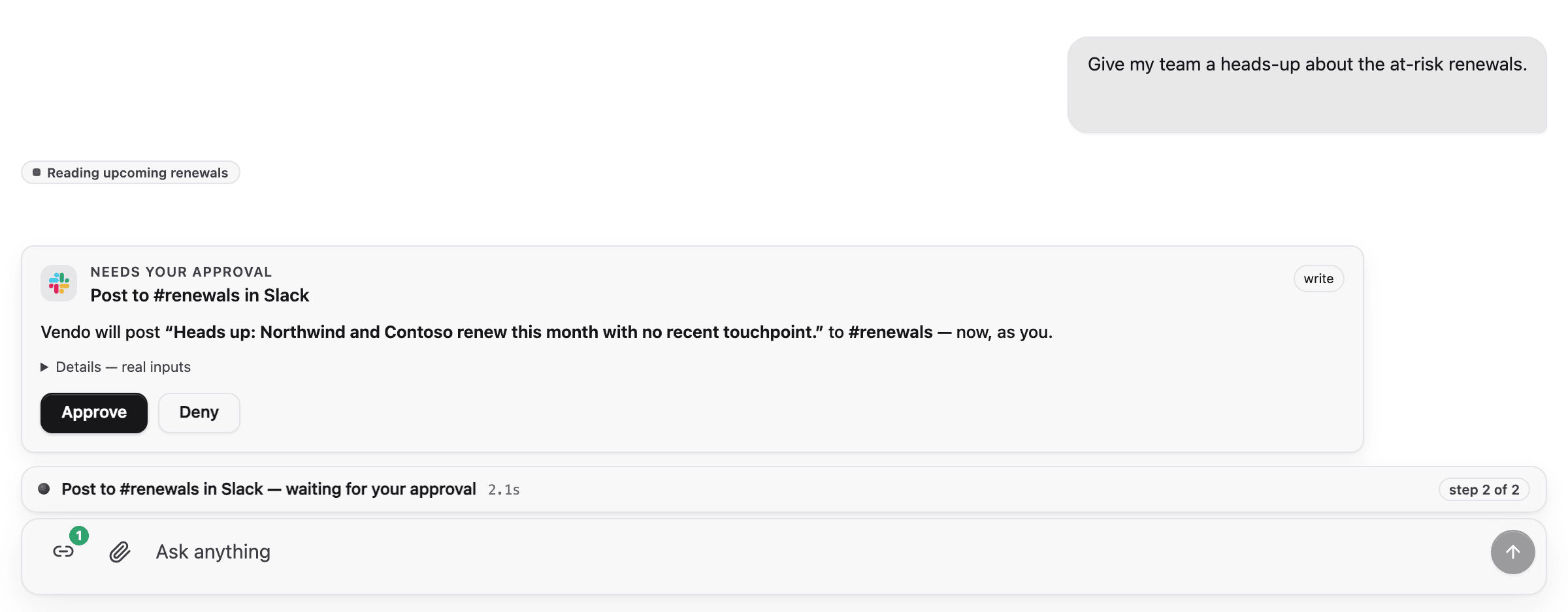
A write action parks the turn on an in-thread approval card showing the exact
request. Approve it and the same turn resumes: the card morphs into a toast,
the tool runs, and the agent confirms.
See [Generated UI and apps](/capabilities/generated-ui) for what a view can do
and who owns it.
## Approvals
A write action parks the turn on an in-thread approval card showing the exact
request. Approve it and the same turn resumes: the card morphs into a toast,
the tool runs, and the agent confirms.
 The decision itself (policy, grants, risk) is server-side; see
[Tools and safety](/concepts/tools-and-safety).
### Approval modal for screen-initiated presses
When a person presses a button inside a generated view and that press parks
on the guard, the confirmation moment shows up as a centered modal over the
page — the same ask the thread card raises, at hero size. Approve or Deny
spends the decision. Esc and the scrim close the modal but do not decide, so
a dismissed ask stays pending and comes back from the badge or the next
press.
Presses queue: pressing Send on two rows raises two approvals, and exactly
one modal is on screen at a time. The next one presents itself once the
current one leaves. An ask settled on another surface (the thread, another
tab) never gets a turn just to say it was already handled.
The modal is auto-mounted everywhere Vendo renders a screen the user can
press into: `VendoSlot`, in-thread app cards and the workspace stage they
expand onto, the [BYO chat embeds](/existing-agents/embeds), and mounted
remix forks. Nothing to wire.
Custom surfaces that render a `TreeView`, `AppFrame`, or `VendoSlot`
themselves pass an `onParked` prop to receive parked presses and can mount
the modal with the [`useApprovalModal`](/reference/hooks#approval-modal-useapprovalmodal)
hook.
```tsx theme={null}
import { AppFrame, useApprovalModal } from "@vendoai/ui/chrome";
function MyStage({ surface, components }) {
const approval = useApprovalModal();
return (
<>
{approval.modal}
);
}
```
## Tool labels
Shipped chrome renders a tool chip every time the agent calls a tool, and an
approval card whenever a call needs the user's sign-off. The wire only carries
the raw tool id, the risk, and the arguments; no friendly name, description,
or arg formatting reaches the client. Chrome humanizes at the render site so
end users never read a raw slug, a lifecycle string, or raw JSON.
### Default fallback
Without any configuration, chrome prettifies the raw id and args:
* `host_email_send` renders as "Email send".
* `gmail_GMAIL_CREATE_EMAIL_DRAFT` renders as "Gmail create email draft".
* Object arguments render as a `Key: value` preview in the approval card.
Non-object args fall back to the server-formatted input preview. The tool
chip itself shows only the humanized label, never an argument summary.
* Consecutive identical chips (same tool, same args) collapse into one entry
with an `×N` count.
* The chip's spinner, check, or error icon carries lifecycle state; no
`output-available` or `Tool:` text ever renders.
* The in-thread approval card no longer prints a fabricated context byline
(the live conversation is already the context). Standalone and queue
approval cards render their real server-provided venue and app context;
neither surface displays principal or presence as separate fields.
The fallback is enough for demos and internal tools. Pass friendly metadata
when you want your own copy for user-facing surfaces.
### Pass friendly metadata to VendoProvider
`VendoProvider` accepts an optional `tools` prop keyed by tool name. Every
field is optional. Missing fields fall through to the default fallback.
```tsx theme={null}
"use client";
import { VendoProvider, type ToolMetaMap } from "@vendoai/vendo/react";
const tools: ToolMetaMap = {
host_email_send: {
label: "Send email",
description: "Send a message from your connected inbox.",
},
host_invoice_create: {
label: "Create invoice",
description: "Draft a new invoice for a customer.",
},
};
export function Providers({ children }: { children: React.ReactNode }) {
return {children};
}
```
| Field | Purpose |
| ------------------------- | -------------------------------------------------------------------------------------------------------------------------------------------------------------------------------------------------------------- |
| `label` | Short display name shown on the tool chip and as the approval card title. |
| `description` | One-line description shown under the approval card title. |
| `formatField(key, value)` | Display formatting for one approval-card field, e.g. integer cents as `$500.00`. Return `undefined` to keep the raw value. Display-only: the raw args still drive the decision hash and the exact-input grant. |
`tools` is additive and UI-side. It does not change the wire, the tool
descriptor, or guard behavior: a call still routes through the same policy,
grant, and approval decision described in
[Tools and safety](/concepts/tools-and-safety).
### Read metadata from your own chrome
`useVendoTools()` exposes the same `ToolMetaMap` for custom surfaces built on
top of the [headless hooks](/reference/hooks). The hook is provider-optional
and returns an empty map when called outside `VendoProvider`, so standalone
components degrade to the formatting fallback.
```tsx theme={null}
"use client";
import { useVendoTools } from "@vendoai/vendo/react";
export function ToolLabel({ name }: { name: string }) {
const tools = useVendoTools();
return {tools[name]?.label ?? name};
}
```
## Slot
A placeholder in your product that users can fill with their own generated
view. Empty, it shows a quiet ghost with a "Design a view" call to action;
filled, it renders the pinned view; broken, it falls back to your original
markup, never a blank hole.
The decision itself (policy, grants, risk) is server-side; see
[Tools and safety](/concepts/tools-and-safety).
### Approval modal for screen-initiated presses
When a person presses a button inside a generated view and that press parks
on the guard, the confirmation moment shows up as a centered modal over the
page — the same ask the thread card raises, at hero size. Approve or Deny
spends the decision. Esc and the scrim close the modal but do not decide, so
a dismissed ask stays pending and comes back from the badge or the next
press.
Presses queue: pressing Send on two rows raises two approvals, and exactly
one modal is on screen at a time. The next one presents itself once the
current one leaves. An ask settled on another surface (the thread, another
tab) never gets a turn just to say it was already handled.
The modal is auto-mounted everywhere Vendo renders a screen the user can
press into: `VendoSlot`, in-thread app cards and the workspace stage they
expand onto, the [BYO chat embeds](/existing-agents/embeds), and mounted
remix forks. Nothing to wire.
Custom surfaces that render a `TreeView`, `AppFrame`, or `VendoSlot`
themselves pass an `onParked` prop to receive parked presses and can mount
the modal with the [`useApprovalModal`](/reference/hooks#approval-modal-useapprovalmodal)
hook.
```tsx theme={null}
import { AppFrame, useApprovalModal } from "@vendoai/ui/chrome";
function MyStage({ surface, components }) {
const approval = useApprovalModal();
return (
<>
{approval.modal}
);
}
```
## Tool labels
Shipped chrome renders a tool chip every time the agent calls a tool, and an
approval card whenever a call needs the user's sign-off. The wire only carries
the raw tool id, the risk, and the arguments; no friendly name, description,
or arg formatting reaches the client. Chrome humanizes at the render site so
end users never read a raw slug, a lifecycle string, or raw JSON.
### Default fallback
Without any configuration, chrome prettifies the raw id and args:
* `host_email_send` renders as "Email send".
* `gmail_GMAIL_CREATE_EMAIL_DRAFT` renders as "Gmail create email draft".
* Object arguments render as a `Key: value` preview in the approval card.
Non-object args fall back to the server-formatted input preview. The tool
chip itself shows only the humanized label, never an argument summary.
* Consecutive identical chips (same tool, same args) collapse into one entry
with an `×N` count.
* The chip's spinner, check, or error icon carries lifecycle state; no
`output-available` or `Tool:` text ever renders.
* The in-thread approval card no longer prints a fabricated context byline
(the live conversation is already the context). Standalone and queue
approval cards render their real server-provided venue and app context;
neither surface displays principal or presence as separate fields.
The fallback is enough for demos and internal tools. Pass friendly metadata
when you want your own copy for user-facing surfaces.
### Pass friendly metadata to VendoProvider
`VendoProvider` accepts an optional `tools` prop keyed by tool name. Every
field is optional. Missing fields fall through to the default fallback.
```tsx theme={null}
"use client";
import { VendoProvider, type ToolMetaMap } from "@vendoai/vendo/react";
const tools: ToolMetaMap = {
host_email_send: {
label: "Send email",
description: "Send a message from your connected inbox.",
},
host_invoice_create: {
label: "Create invoice",
description: "Draft a new invoice for a customer.",
},
};
export function Providers({ children }: { children: React.ReactNode }) {
return {children};
}
```
| Field | Purpose |
| ------------------------- | -------------------------------------------------------------------------------------------------------------------------------------------------------------------------------------------------------------- |
| `label` | Short display name shown on the tool chip and as the approval card title. |
| `description` | One-line description shown under the approval card title. |
| `formatField(key, value)` | Display formatting for one approval-card field, e.g. integer cents as `$500.00`. Return `undefined` to keep the raw value. Display-only: the raw args still drive the decision hash and the exact-input grant. |
`tools` is additive and UI-side. It does not change the wire, the tool
descriptor, or guard behavior: a call still routes through the same policy,
grant, and approval decision described in
[Tools and safety](/concepts/tools-and-safety).
### Read metadata from your own chrome
`useVendoTools()` exposes the same `ToolMetaMap` for custom surfaces built on
top of the [headless hooks](/reference/hooks). The hook is provider-optional
and returns an empty map when called outside `VendoProvider`, so standalone
components degrade to the formatting fallback.
```tsx theme={null}
"use client";
import { useVendoTools } from "@vendoai/vendo/react";
export function ToolLabel({ name }: { name: string }) {
const tools = useVendoTools();
return {tools[name]?.label ?? name};
}
```
## Slot
A placeholder in your product that users can fill with their own generated
view. Empty, it shows a quiet ghost with a "Design a view" call to action;
filled, it renders the pinned view; broken, it falls back to your original
markup, never a blank hole.
 ## Remixable surfaces
Wrap a component of your own product to make it forkable:
```tsx theme={null}
import { Remixable } from "@vendoai/ui/chrome";
```
At rest a small muted ✦ sits in the element's top-right corner. Hovering (or
tabbing into) the element blooms it in place into a **✦ Remix** pill, held
open briefly so the cursor can travel to it. Clicking forks the component the
engine captured at sync time — a deterministic copy, no model call — and the
user's fork renders **in place of the wrapped element**, sandboxed, for that
user only. On a remixed surface the pill opens a small management popover
(status, open in panel, revert). The bloom snaps under
`prefers-reduced-motion`.
Add the `review` flag (``) for components whose remixes a
host reviewer must approve: the owner keeps seeing the original until
approval, and the approved version then renders in place natively. See
[Host components](/customize/host-components#remix-fork-a-wrapped-component)
for capture rules and the review flow.
## Embeds for your own agent's chat
If your product keeps its own agent loop and spreads in the
[guarded tool pack](/existing-agents/overview), three embed components render
Vendo inline in that chat instead of the chrome above. See
[Embeds and envelopes](/existing-agents/embeds) for the envelope contract,
the three components, and their props.
## Theming
Every component above re-themes from one token file. Extract it with
`vendo init`, or hand-edit `.vendo/theme.json`. See
[Theming](/customize/theming) for the full token reference.
## Remixable surfaces
Wrap a component of your own product to make it forkable:
```tsx theme={null}
import { Remixable } from "@vendoai/ui/chrome";
```
At rest a small muted ✦ sits in the element's top-right corner. Hovering (or
tabbing into) the element blooms it in place into a **✦ Remix** pill, held
open briefly so the cursor can travel to it. Clicking forks the component the
engine captured at sync time — a deterministic copy, no model call — and the
user's fork renders **in place of the wrapped element**, sandboxed, for that
user only. On a remixed surface the pill opens a small management popover
(status, open in panel, revert). The bloom snaps under
`prefers-reduced-motion`.
Add the `review` flag (``) for components whose remixes a
host reviewer must approve: the owner keeps seeing the original until
approval, and the approved version then renders in place natively. See
[Host components](/customize/host-components#remix-fork-a-wrapped-component)
for capture rules and the review flow.
## Embeds for your own agent's chat
If your product keeps its own agent loop and spreads in the
[guarded tool pack](/existing-agents/overview), three embed components render
Vendo inline in that chat instead of the chrome above. See
[Embeds and envelopes](/existing-agents/embeds) for the envelope contract,
the three components, and their props.
## Theming
Every component above re-themes from one token file. Extract it with
`vendo init`, or hand-edit `.vendo/theme.json`. See
[Theming](/customize/theming) for the full token reference.